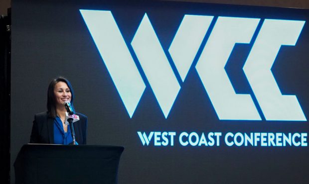
New West Coast Conference Logo Gets Mocked On Twitter
Mar 16, 2019, 3:17 PM | Updated: 3:19 pm
Kyle Terada, WCC

SALT LAKE CITY, Utah – The West Coast Conference recently unveiled a new rebranded logo which has drawn mixed reviews from folks all over the country.
The conference, in which BYU plays several sports including men’s and women’s basketball, was likely due for a rebranding. However, the new look may be a little underwhelming in the eyes of fans.
Here are some of the best reactions from Twitter on the new look for the WCC:
The new WCC logo looks like the place to go to get a killer deal on a used computer. pic.twitter.com/YvSahlyBtk
— Boney Fuller (@boneyfuller) March 14, 2019
The WCC logo looks like it belongs to a credit union that has 2 branches and even less clients.
— JC Eastwood (@jc_eastwood) March 14, 2019
I feel like it should say WCC technical college. That’s just what the logo makes me think.
— Mike D (@miked157) March 14, 2019
BREAKING: The source for the WCC logo has been unearthed. pic.twitter.com/FpcqiWB6xX
— Kylo Murray…ingham (@Quoth_the_Maven) March 13, 2019
New WCC logo… pic.twitter.com/2nWWWZeUUR
— Tyson (@TysonHigham) March 13, 2019